Minimalist and modern signage is more than a clean look, it is a fast way to make your business feel premium, confident, and instantly recognisable. When your shopfront, office, or vehicle branding is sharp and uncluttered, customers know what you do in seconds, and they trust you sooner. That is powerful in busy Australian streets, centres, and commercial precincts where attention is hard to win.
Minimal signage is not “boring”, it is strategic. Fewer elements means your brand name, icon, and key message land harder. The best signage does not compete with your environment, it controls it. Think about a retail strip, a medical centre, or a corporate foyer: there is already a lot happening. A pared-back sign creates calm and clarity, which feels modern and professional.
For the kinds of businesses Pro Group Signs works with every day, small to medium teams who want fast turnaround, quality, and a fully managed process, this style is a smart match for brand goals and time-poor owners.
Minimalist design is not “less effort”. It is precision. Here are the essentials that make it work:
1) Strong typography
Pick a typeface that matches your industry. A bold sans-serif can feel modern and confident, while a refined serif can feel boutique or premium. The trick is legibility from the viewing distance that matters, across day and night conditions.
2) Clear hierarchy
Your business name is the hero. Taglines and extras come second. If everything is loud, nothing is heard. A clean hierarchy keeps your sign readable at a glance, which is exactly what you want for foot traffic and passing cars.
3) Plenty of breathing room
Whitespace is not wasted space. It is what gives a sign its “expensive” feel. Give your logo room, avoid cluttered layouts, and let the materials do the talking.
Minimalist and modern signage often shines brightest when the fabrication is premium. Instead of relying on lots of visual elements, you rely on finish, depth, and lighting to create impact.
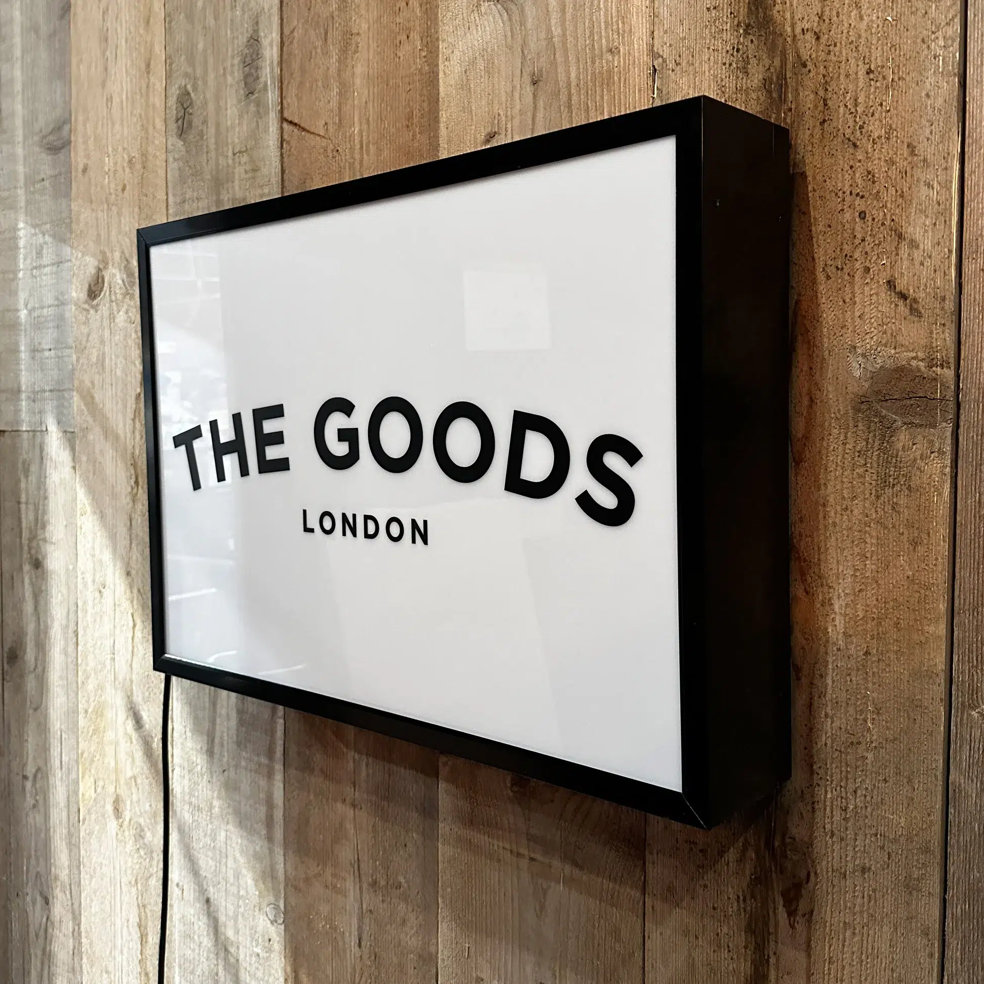
Acrylic signs and panels
Acrylic is a favourite for clean, polished branding. It suits reception signs, suite plaques, internal directories, and feature logo panels. Gloss, matte, and frosted options can be paired with stand-offs for depth and shadow lines.
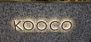
3D lettering and logo builds
Metallic finishes and minimal colour palettes
Brushed aluminium, stainless look vinyl, and subtle metallics can add sophistication without making the design busy. Even a single colour plus texture can feel premium when executed well.
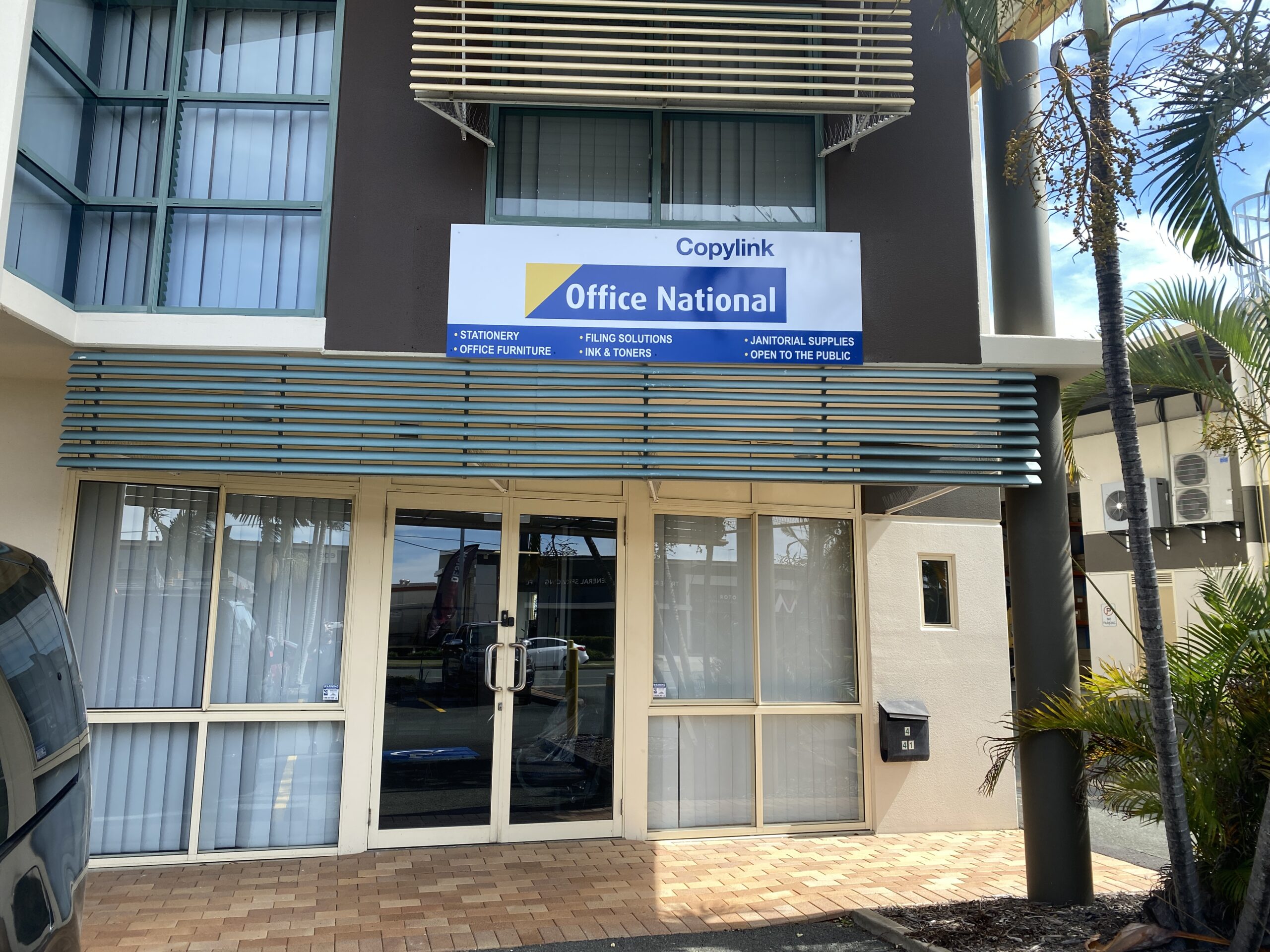
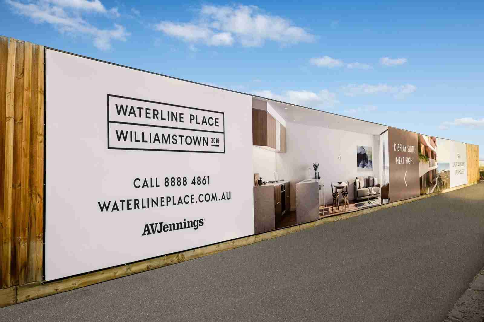
Your shopfront is your handshake. Minimalist and modern signage works brilliantly here because it keeps your brand readable and memorable from the street.
A clean shopfront approach often includes:
If you are in retail, hospitality, beauty, or professional services, the goal is the same: make the decision easy for customers. They should instantly understand who you are and feel confident stepping inside.
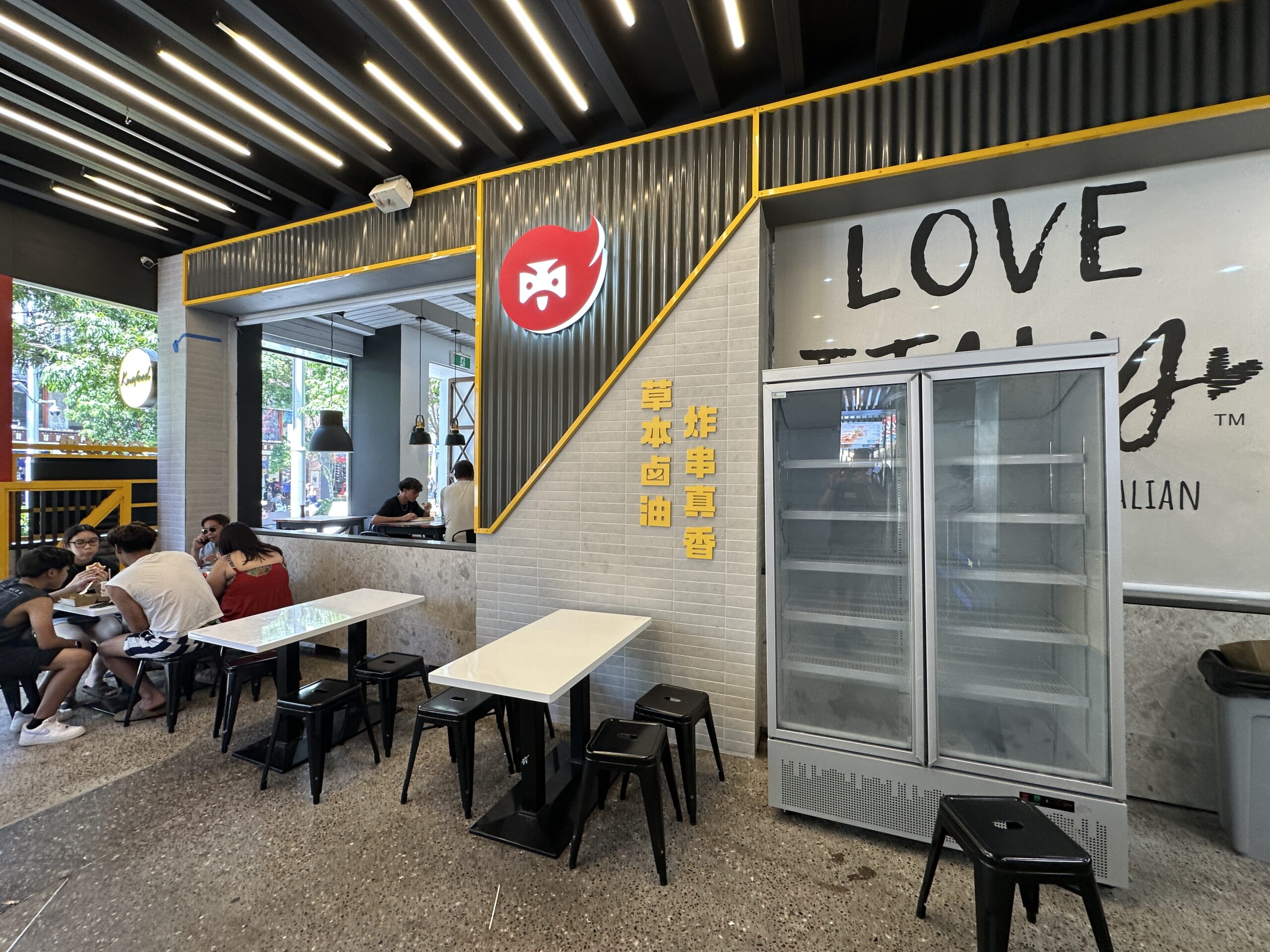
Minimal signage inside a workplace can transform how customers feel the moment they enter. For corporate offices, medical practices, and commercial spaces, minimalist styling reads as credible and established.
High impact interior ideas include:
This is where minimalist and modern signage can quietly do a lot of heavy lifting. It makes your space feel considered, which builds trust.
Directional signage is not just a “nice to have”. It improves flow, reduces interruptions to staff, and helps customers feel comfortable. Minimal design is perfect for wayfinding because clarity matters more than decoration.
A strong system usually includes:
Minimal does not mean vague. It means precise. The end result is signage that looks modern and works hard every day.
If your sign needs to perform at night or in shaded locations, lighting becomes part of the design. Done well, illumination stays clean and modern, not flashy.
Options include:
Minimalist and modern signage thrives on contrast. A dark wall with crisp white lettering. A light background with a bold mark. A matte finish with a glossy logo element. These combinations create attention without clutter.
Modern signage needs to handle heat, UV, wind, and the general wear that comes with busy locations. Material choice and installation quality matter as much as the design.
A professional signage partner will consider:
When signage is minimalist, every detail shows. That is why fabrication and install standards are non-negotiable.
If you have multiple locations, Minimalist and modern signage systems are easier to roll out consistently. A tight brand kit, consistent materials, and repeatable fabrication specs keep every site looking the same, which protects your brand.
That consistency is a big win for gyms, real estate offices, and growing service businesses. A clean, scalable look helps customers recognise you instantly, no matter the suburb or city.
Minimalist and modern signage looks its best when design, print, and installation are handled as one coordinated project. Pro Group Signs supports businesses with a fully managed approach, from concept and artwork to production and install, so you are not juggling suppliers or guessing what will work.
A smooth process typically looks like:
If you are updating an outdated shopfront, opening a new location, refreshing an office, or rolling out signage across multiple sites, minimalist and modern signage keeps things fast, clear, and high quality.
Minimalist and modern signage can make your brand feel sharper, more premium, and easier to trust, without shouting for attention. If you want signage that looks modern, reads clearly, and is built to last, Pro Group Signs can help you choose the right materials and deliver a polished result from start to finish.
📧 Contact Us Anytime to Find the Signage Solution for You
Please contact us: https://progroupsigns.com.au/contact
Email: [email protected]
Phone: +1300 013 982
Copyright © 2026 ProGroup Signs Australia | All Rights Reserved | HTML Sitemap
Powered by BsharpTech