Signage colour psychology is one of the most powerful tools in visual marketing. The colours you choose for your signage can shape how customers feel about your brand, influence their buying decisions, and determine whether they engage with your business.
At Pro Group Signs, we understand that great signage is more than words and graphics – it’s about the emotional impact. By applying signage colour psychology, you can create signs that not only look attractive but also connect with your audience on a deeper level.
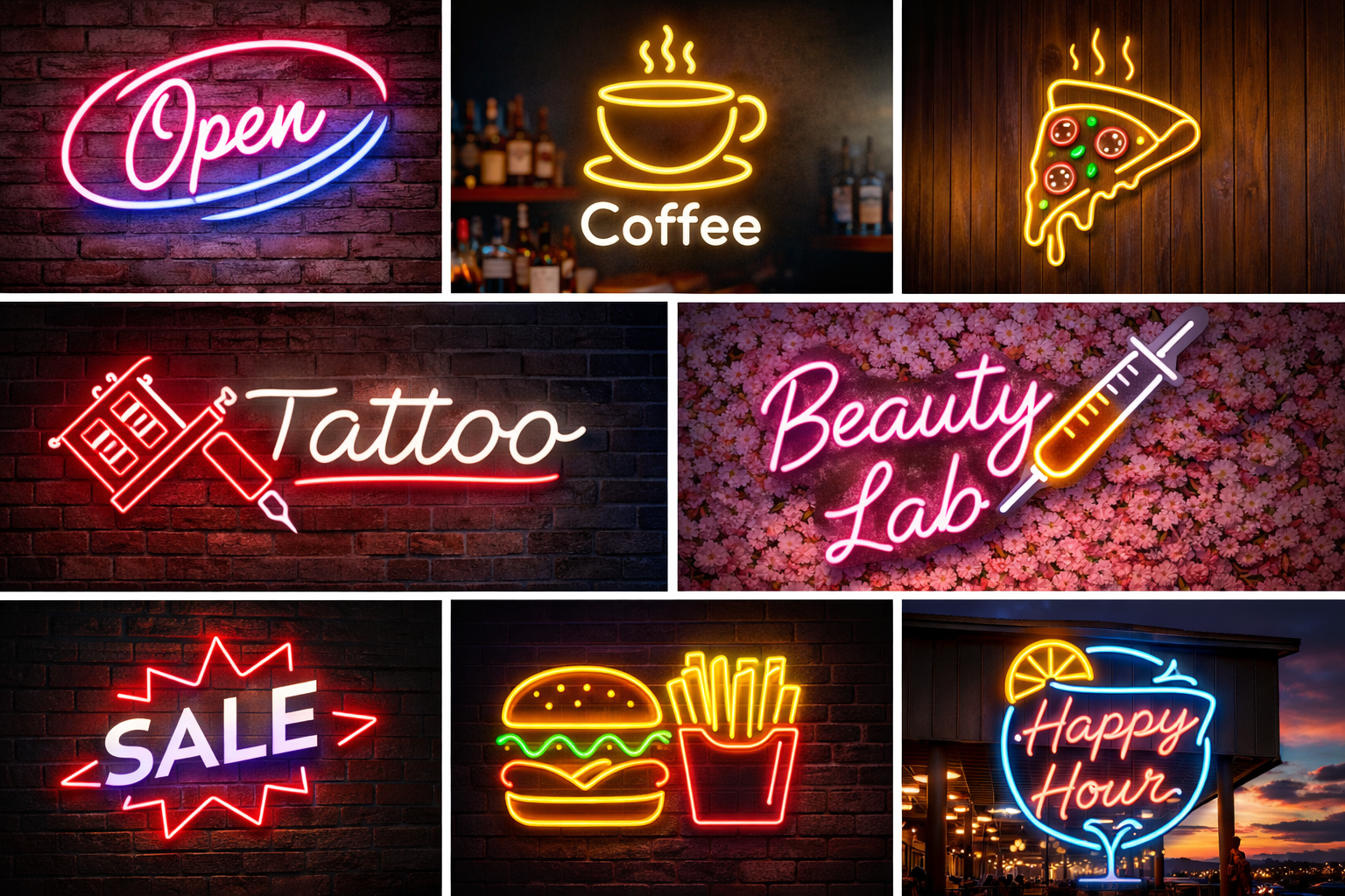
Colour isn’t just decoration. In signage colour psychology, every shade has meaning and triggers different emotions. For example, blue often conveys trust and professionalism, red creates urgency and excitement, and green suggests health and sustainability.
When customers pass your store or attend your event, their first impression is visual. Choosing colours strategically ensures that impression is positive and aligned with your brand values.
Understanding the basics of signage colour psychology will help you make informed design decisions. Here are some common associations:
Red – Energy, urgency, excitement
Blue – Trust, reliability, calmness
Yellow – Optimism, warmth, friendliness
Green – Nature, health, growth
Black – Sophistication, luxury, authority
White – Cleanliness, simplicity, openness
By pairing colours effectively, you can reinforce your brand message and influence customer behaviour.
Your brand identity should guide your use of signage colour psychology. If your business is all about innovation and energy, bright and bold colours may be ideal. If you’re in a more conservative industry like law or finance, a palette of blues, greys, and whites can project stability and professionalism.
Our design team ensures your signage colours not only look good together but also communicate the right emotions to your target market.
It’s not just the colours themselves that matter it’s how they work together. In signage colour psychology, contrast plays a big role in legibility and impact. A high-contrast colour scheme makes text stand out from its background, ensuring customers can read your message from a distance.
For example, white text on a dark blue background or black text on a yellow background will grab attention far more effectively than low-contrast combinations.
One of the most powerful applications of signage colour psychology is directing customer behaviour. Strategic use of colour can:
Highlight promotions (e.g., bright red or orange)
Create urgency for sales (e.g., red with bold fonts)
Lead customers through a store (e.g., coloured arrows or floor decals)
Make calls-to-action pop (e.g., contrasting button colours on digital signage)
When colours are used with intention, they can subtly guide customers toward the actions you want them to take.
Colour meanings can vary across cultures and demographics. In signage colour psychology, understanding your audience is essential. For instance, while white often symbolises purity in Western cultures, it may represent mourning in some Asian cultures.
Likewise, younger audiences may respond better to bright, energetic colours, while older demographics might prefer muted, classic tones.
Seasonal changes are an excellent opportunity to refresh your signage with signage colour psychology in mind. For example:
Spring – Pastels and fresh greens for renewal and growth
Summer – Bright yellows, blues, and corals for fun and energy
Autumn – Warm reds, oranges, and browns for comfort and tradition
Winter – Cool blues and whites for calm and elegance
Seasonal colour updates keep your signage relevant and engaging.
Even the most carefully chosen colours can look different depending on the material. In signage colour psychology, finishes such as gloss, matte, or metallic can amplify or soften the emotional impact of a colour.
For example, a metallic gold finish can elevate a luxury brand, while a matte pastel can create a soft, welcoming feel.
We incorporate signage colour psychology into every stage of our design process. From initial consultation to final installation, we focus on choosing colours that reflect your brand, suit your audience, and achieve your goals.
Our in-house production ensures colours are printed with precision, so what you see in the design is exactly what appears on your finished sign.
When applied correctly, signage colour psychology can increase brand recognition, attract more customers, and boost sales. The right colours make your signage more noticeable, more memorable, and more persuasive. Over time, this can have a significant impact on your bottom line.
Your signage is more than a label, it’s a silent communicator. With signage colour psychology, you can influence how customers feel, think, and act.
Call us on: 1300 013 982
Email: [email protected]
Or visit our Contact Page to discuss a signage design that uses colour to your advantage.
Let’s create signage that doesn’t just get noticed – it gets results.
Copyright © 2026 ProGroup Signs Australia | All Rights Reserved | HTML Sitemap
Powered by BsharpTech